

Creating a 4-H project exhibit poster with impact
Every 4-H’er can create a project exhibit poster to showcase what they’ve learned while working on their 4-H project each year. Project exhibits are submitted for judging at the annual Marion County 4-H Showcase, and most projects are also eligible to advance to the Indiana State Fair.
Use the guidelines and tips below to create a poster with impact!
Questions?
Contact the Marion County 4-H office:
marion4h@purdue.edu
317-275-9305
4-H Poster Guidelines
General
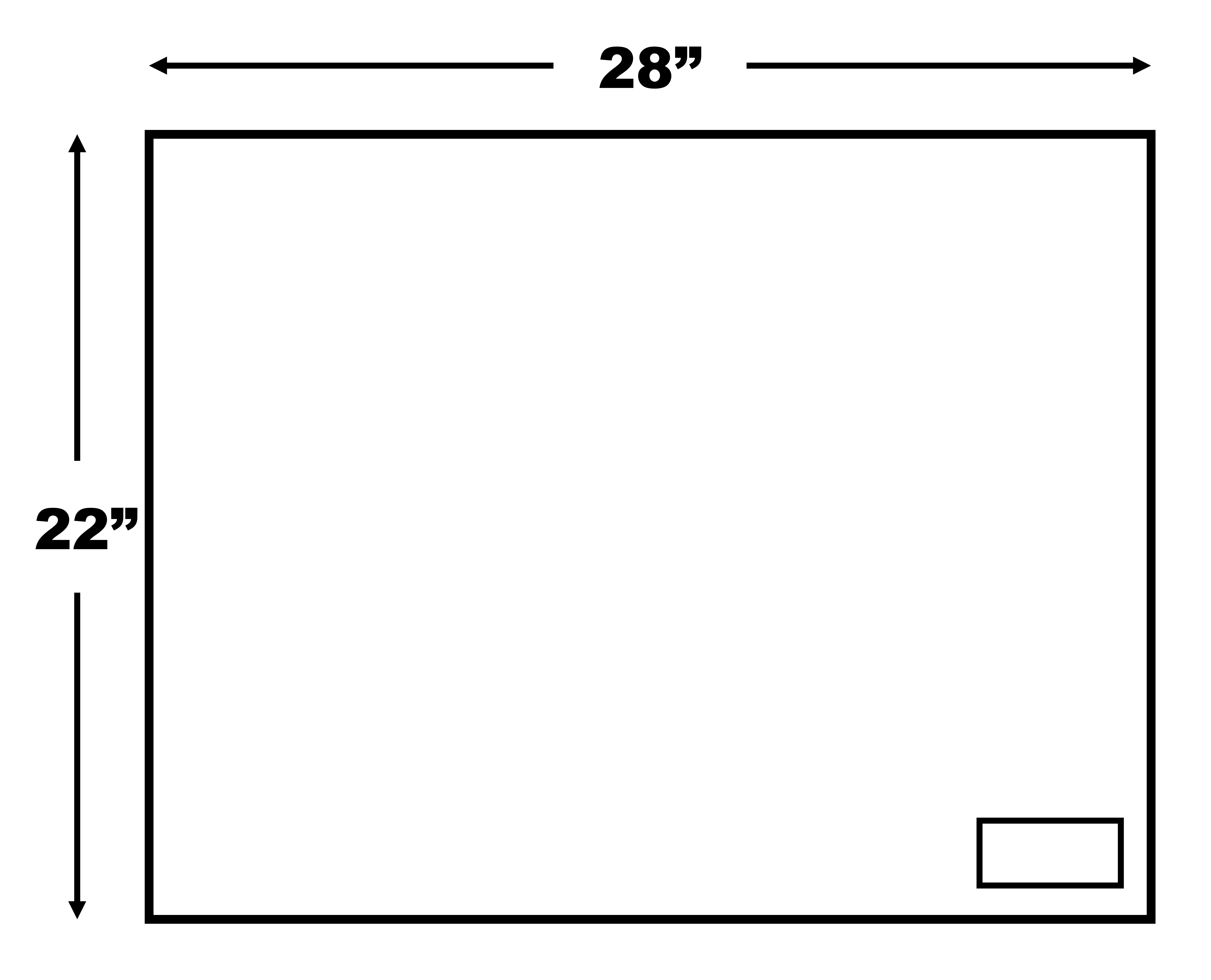
- All 4-H poster exhibits must be 28” x 22” and displayed horizontally. Cloverbud (grades K-2) posters should be half that size (22" x 14").
- Posters may be made on any color poster board or suitable materials (fabric, wrapping paper, etc.) and then must be securely mounted on a solid foam core backing. The foam core backing itself can be used as the poster if you like.
- Posters should be covered with a clear plastic, acetate, or transparent covering to protect your exhibit and make it more attractive.
- Posters must be labeled in the lower right corner with your name, county, 4-H club, project, and division (unless instructed differently in your project manual).
- Your local Extension office can provide the correct size of foam core backing and plastic sleeves for a small price ($3-$5, extra $1 for plastic sleeve; see price list for details).
Backing
- Plywood, masonite, and similar materials may not be used for poster backing unless otherwise specified in your project manual (for example, small engines).
- Using rubber cement to attach your poster board to the foam core backing allows the foam core backing to be re-used.
- Attach your poster board or other material to your foam core backing before you put on anything else (pictures, labels, etc.). Make sure you let it dry for a couple days or the cement will retain moisture and ruin the poster.
Covering
- Lay a sheet of plastic (approximately 34” x 28”) on a hard surface. Place your poster, including foamcore backing, face down and tape the plastic to the backside of the poster.
- Heat-shrink plastic is available at craft, hardware, and discount stores. Do not use Saran Wrap!
- You may also have framing shops cover your poster for a fee.
- Your final poster should be about ¼ to ½ inch thick.
Watch this Video: How to Make a 4-H Poster
Planning Your Poster
- Read your project manual and your county project guidelines.
- Decide on a subject to express one thought or idea.
- Decide on your WHO – WHAT – WHY – HOW. Only when you have clearly defined the answers to WHO, WHAT, and WHY can you proceed to HOW.
- WHO is the audience you want to reach?
- WHAT is the subject you want to present?
- WHY – what is the purpose of your poster?
- Decide HOW to express your message.
- Select a TITLE. The title you choose should:
- Identify your exhibit: tell about the content
- Be short: limit it to 4-5 words
- Be simple: use short, simple words
- Attract attention
- Examples:
- Personal – “Your Food Dollars”
- Action – “Make Your Own Belt”
- Question – “How Well Are You Fed?”
- Catchy – “Freeze Food for Fresh Flavor”
- Plan an ARRANGEMENT to:
- Attract and interest the viewer
- Provide good balance – formal or informal
- Be simple, neat, clear, interesting, and in good taste
Making 4-H Posters with Impact
Your poster needs STOPPING POWER
- Appearance should be simple – not too much information crowded on one poster.
- Make sure your poster can be read at a glance – have a specific main idea, and use wording that is short and to the point.
- Have a short, simple, and catchy title that may suggest a theme.
- Add a frame or border.
Your poster should be INTERESTING
- Your poster should attract attention immediately.
- Use contrasts like unusual lines, shapes, and textures.
- Use interesting colors in your background, objects, and lettering.
- Use a combination of words, shapes, and pictures.
- Use your creativity to make your display attractive.
Your poster should be CONVINCING
- It should have a well-expressed main idea.
- It should convey a one specific message accurately and completely.
But you have to remember the MECHANICS
- A soft no. 2 pencil can be used to make guide line marks which are easily erased with an art gum eraser.
- Make sure items are securely attached or mounted to your poster board or background material. Don't use staples, tacks, or tape (tape is OK in some cases, such as attaching leaves).
- Make cuts evenly, paste cleanly, and measure for centers and parallels.
- Check for correct spelling.
Lettering
- Use guide lines or a ruler for consistency and neatness.
- Don’t crowd lettering onto your poster.
- Use plain, bold lettering and lines.
- Lower case letters are more easily read than capitals.
- Horizontal letters are easier to read than vertical letters.
- Be sure your lettering is large enough to be read from a short distance.
- Keep letters in a message all one color.
- Various types of lettering can be used, such as gummed letters, cutout letters, pressure-sensitive transfer letters, or you can create letters from felt, paper, cardboard, plastic, metal, or wood.
- You can use lettering aids such as rubber stamps or lettering stencils.
- Supplies are available at bookstores and office supply stores.
Color
- Use neutral or soft colors for backgrounds (grays, greens, and blues in pastel shades). Don't use fluorescent poster board.
- Color of lettering should contrast with background.
- Limit to two or three colors – usually it is best to select one lettering color to go with your overall background color. A third color may be used in small amounts for accent and attention.
- Use bright, intense colors for smaller areas and for your center of interest. Red is a good accent color.
How to influence the viewer’s eye:
- Think about the direction your objects or figures are facing. The viewer’s eye should be led in and around the display, not out of it.
- Keep heavy materials from coming too close to the top, bottom, or sides of your poster.
- Create a sequence of information so that the viewer’s eye moves from one object to the next in a logical order.
- Use devices such as overlapping lines, color repeats, etc. to pull groups of information together so that attention is directed to specific objects in your display.
- Think about the amount and arrangement of contrasting areas. A pattern of lights and darks leads the eye in a certain direction.
Need inspiration and ideas?
- Look at advertisements, billboards, theater signs, travel posters, magazines, etc.