4-H
Putting Your Poster Over the Top
A Successful Poster:
- Catches the eye.
- Is simple and clear.
- Makes people stop, read, and remember.
Planning a Poster:
- Who are your viewers?
- What do you want them to know?
- Think of a clever theme or slogan.
- Make a small rough sketch. Remember to leave some blank space because uncluttered posters are easier to read.
Basic Poster Requirements:
- Refer to the 2023 DeKalb County 4-H Handbook, "Poster Guidelines," and the specific requirements for your project(s). Always read and understand all the rules for your project before doing anything.
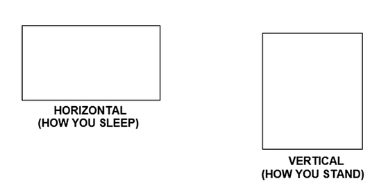
- Orientation: All 4-H posters must be horizontal (exception: some photography exhibits).

- Size: All posters must be 22" x 28" (exceptions: some photography exhibits and mini 4-H).
- All poster projects must contain a stiff backing the same size as the poster, and poster board alone is not acceptable.
- All poster projects must be covered with some kind of clear plastic sheeting for protection. Plastic sleeves are available from the Extension Office for a small fee.
- All poster projects should have a label in the lower right corner with the exhibitor's name, township, and grade. Refer to the Handbook and specific project requirements for other information to be included.
- All poster projects should include a reference list indicating where information was obtained. Refer to Handbook for guidelines for this list.
Materials:
- Foam board, mat board, poster board, etc. and stiff backing
- Clear plastic
- Variety of colored papers
- Double-stick tape or glue
- Markers or paints
- Scissors or paper cutter
- Ruler and pencil
- Letters
- Stencils
- Computer and printer
Choosing Colors:
- Color combinations affect how easily the message is read, as well as, the overall appearance of the poster.
- Avoid using too many different colors for the purpose of letters and backgrounds. Two or three should be sufficient. Color photos or clipart may be added to enhance your poster, but be sure they don't overwhelm your main point.
- Let the most important items be in the most important color.
- Consider the contrast, which means use dark letters on a light background and light letters on a dark background.
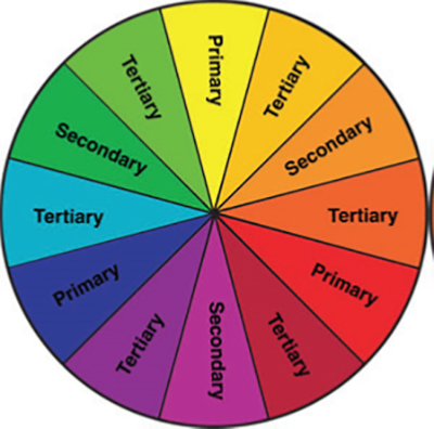
- Use the color wheel to help you choose colors. Analogous colors are any three colors which are side by side on a 12-part color wheel. Complimentary colors are any two colors which are directly opposite each other. This creates maximum contrast.

- Consider the color context, which is how color behaves in relation to other colors. Compare the contrast effects of different color backgrounds for the same red square on the diagram below.

Lettering:
- Lower case letters are easier to read than all capitals. Use capitals for emphasizing an important phrase or idea or to add variety.
- Avoid fancy or script lettering because it can be hard to read.
- Letters may be cut out by hand or by machine (i.e. Cricut), precut letters may be purchased, or headings may be produced on the computer and then affixed to the poster.
- Use different size lettering for items of varying importance.
- Allow margins to keep items from running together and looking too cluttered.
- Refer to the table below for letter sizes and their effectiveness.
| LETTER SIZE | VIEWING DISTANCE |
| 1/4 inch | 8 feet |
| 1/2 inch | 16 feet |
| 1 inch | 32 feet |
| 2 inches | 64 feet |
The Three R's of Posters - Revise, Rearrange & Redo:
- Using your original sketch, lay out all your components on your poster. How does it look? Revise and rearrange as needed. Redo anything that should be a different color or size. Move things around until you're happy with the overall effect and message of your poster.
- Ask your parents/guardians, project helpers, other 4-H members, or leaders to look at your poster and tell you what they think.
- Affix everything in place.
- Remember - NEATNESS COUNTS!!!!

